Comparing ROC Curves in JMP: Part 1 – Basics & Single Test with Confidence Bands
📅 Wednesday, July 1, 2015
Tags: ROC curve, sensitivity, specificity, AUC, predictive models, cutoff value, JMP software, medical statistics
Introduction: What is an ROC Curve?
ROC curves (Receiver Operating Characteristic) are a fundamental tool for evaluating classification models, particularly in terms of sensitivity (true positive rate) and specificity (1 – false positive rate).
Some time ago, my colleague Prof. Dr. Dr. David Meintrupp developed a helpful script to analyze and compare ROC curves in JMP. With this add-in, you can not only generate a single ROC curve with confidence bands, but also compare multiple tests.
Blog Series in Three Parts:
-
Part 1: Basics & creating a ROC curve with confidence bands for a single test
-
Part 2: Identifying the optimal cutoff value
-
Part 3: Comparing multiple tests & partial AUC (pAUC)
📚 If you're new to this topic: A great starting point is something like Introduction to ROC Analysis.
The script/add-in for JMP is available here: [Insert link]
Example Dataset: aSAH from the R Package “pROC”
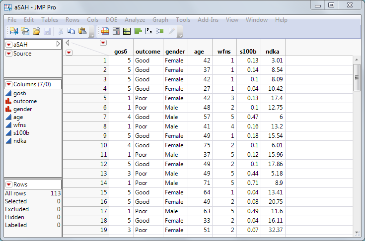
To demonstrate, we’ll use the aSAH dataset (aneurysmal subarachnoid hemorrhage) containing data from 113 patients.
Goal: Find a clinical test that reliably predicts patient outcome, since patients with a poor outcome often require more intensive medical care [1].
There are three tests to evaluate:
-
wfns
-
s100b
-
ndka
Key question: Which of these tests is best at identifying patients with a poor prognosis?
A "good test" fulfills two main criteria:
-
High sensitivity: reliably identifies patients with poor outcomes
-
Low false-positive rate: minimizes the risk of misclassifying healthy patients
An ROC curve visualizes the trade-off between sensitivity and false-positive rate in a single chart – making it ideal for assessing and comparing diagnostic tests.
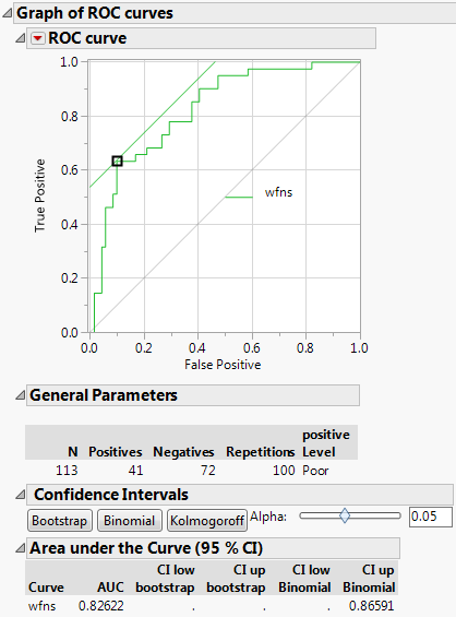
How to Create a ROC Curve for “wfns” in JMP
Start the JMP script. A dialog box will appear:
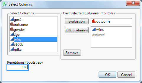
- Evaluation column: contains the outcome, e.g., "Good" vs. "Poor"
- ROC columns: at least one test, e.g., wfns
(Note: For predictive models like logistic regression, random forests, etc., use the column containing the predicted probabilities.)
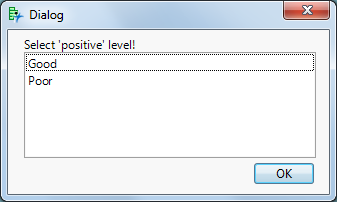
After clicking OK, a second dialog asks which value should be considered "positive" — in our case, "Poor" (poor outcome).
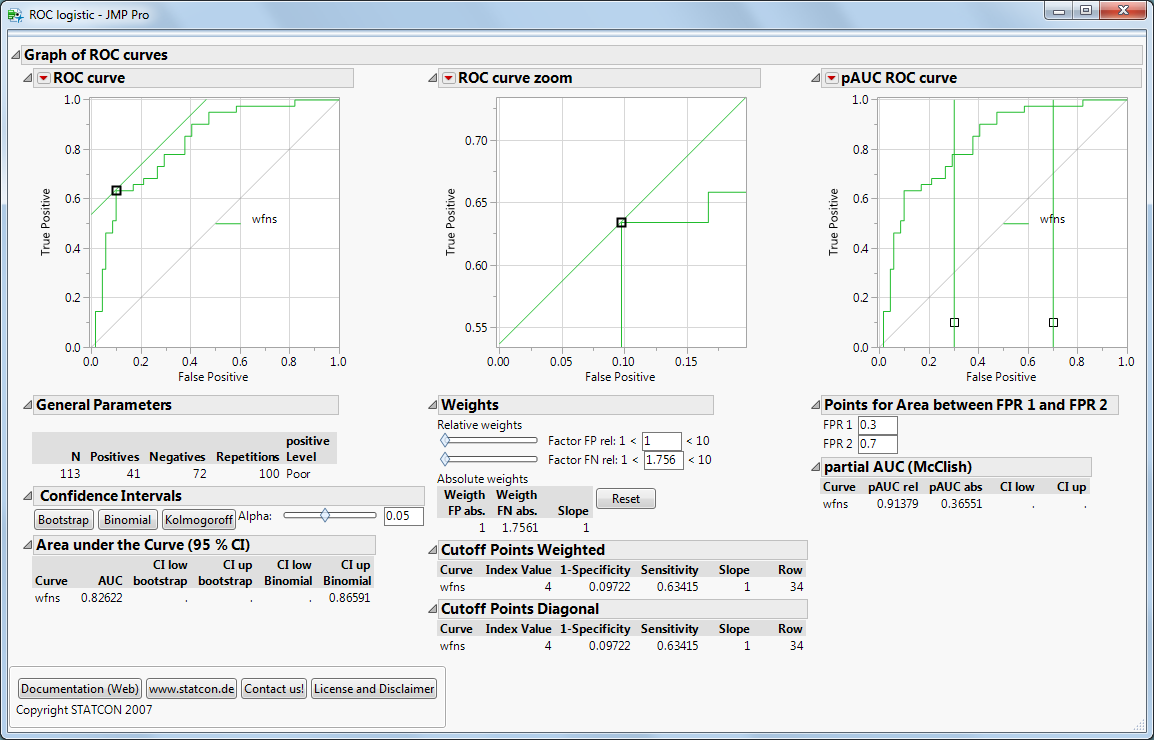
Interpretation: AUC & Confidence Bands
-
The AUC (Area Under the Curve) is 82% — a good value depending on the application.
-
A perfect prediction would achieve AUC = 1.0.
-
AUC is particularly useful when comparing multiple tests.
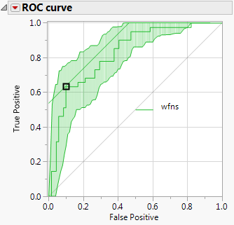
Click “Bootstrap”!
JMP will overlay green confidence bands around the ROC curve, indicating how stable and reliable the test is.
-
If the ROC curve lies well above the diagonal (which represents random guessing), the test performs well.
-
In our case, the diagonal lies outside the confidence bands — a strong indicator of model quality.
Why aren’t the bands symmetrical? We’re using bootstrap confidence bands here. Alternatively, binomial or Kolmogorov bands (which are classically symmetrical) can be used.
Coming Up: Cutoff Value & Comparing Tests
In the next post, we’ll discuss how to identify the optimal cutoff for your test. Finally, we’ll show how to compare multiple tests using ROC curves and partial AUC (pAUC) approaches.
X. Robin et al.: pROC: An open-source package for R and S+ to analyze and compare ROC curves
M. Müller et al.: ROC Analysis in Medical Diagnostics