
Exploratory data analysis
Be it the evaluation of a DoE (Design of Experiments), of process data or the search for a good model for a data mining competition: The most important basis for successful data evaluation is to understand the data as well as possible. Of course, expert knowledge plays a major role in this. However, detailed exploratory data analysis is at least as helpful. In this blog post, I will discuss some typical questions of Exploratory Data Analysis (EDA) and present common tools to answer these questions. This time I will focus on the univariate analysis of data using histograms and bar charts. In particular, I want to show how much different information can often be derived from these simple graphs.
Example: Forecasting income
For this blog post, I'm looking at a popular dataset from the field of datamining. The UCI Machine Learning Repository website has many sample datasets on datamining/data science/knowledge discovery in databases. In what follows, I will work with the Adult dataset. It contains various demographic data of adult U.S. citizens from the 1994 Census. The goal is to use this information to predict which individuals have an annual income >$50,000.
A first overview
Depending on the type of data set and the respective question, an EDA often looks very different. However, at the very beginning there are often very similar questions:
- What are the variables?
- What is the scale level of each variable?
- Are there obvious errors in the data?
- Are there potential outliers?
A simple way to get clarity on this is to look at the individual variables as a histogram (for continuous variables) or as a bar chart (categorical variables).
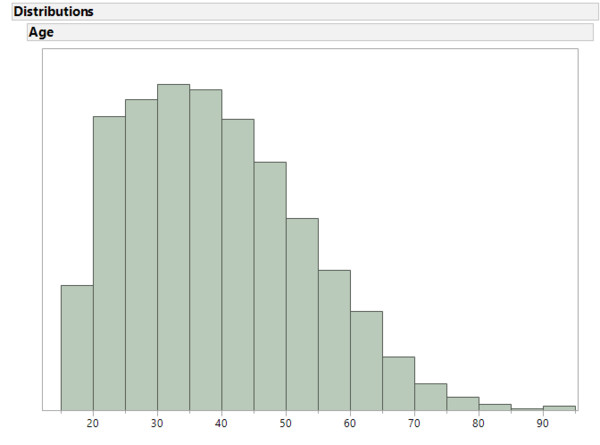
Histogram in JMP
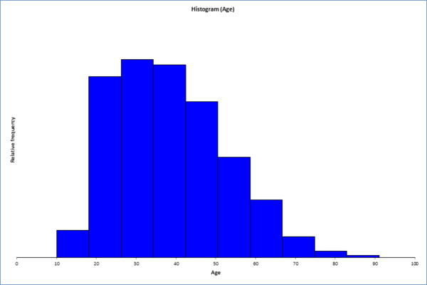
Histogram in XL-Stat
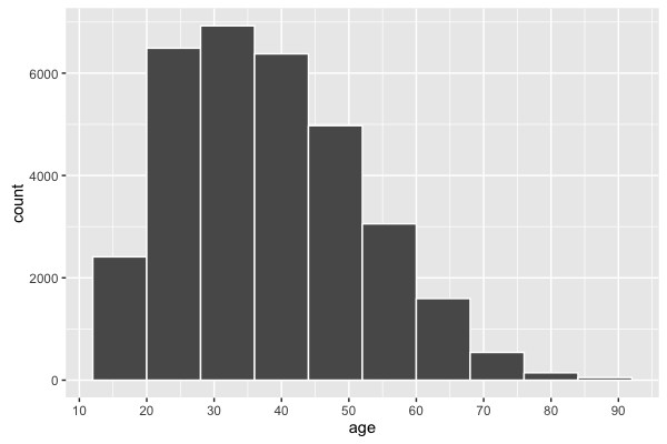
Histogram in R
Explorative Data Analysis: Adult Data
#--------------------------------------------+
# Explorative Data Analysis: Adult Data
#--------------------------------------------+
library(ggplot2)
# Import
adult = read.csv("https://archive.ics.uci.edu/ml/
machine-learning-databases/adult/adult.data", header = FALSE)
head(adult)
# Add column names
colnames(adult) = c("age", "work_class", "fnlwgt", "education",
"education_num", "marital_status", "occupation",
"relationship", "race", "sex", "capital_gain",
"capital_loss", "hours_per_week", "native_country", "y")
# Überblick: Alter Histogram
ggplot(adult, aes(x=age)) +
geom_histogram(binwidth = 8, color="white") + # Control Binwidth
scale_x_continuous(breaks=seq(0, 100, 10)) # Adjust X-axis-ticks
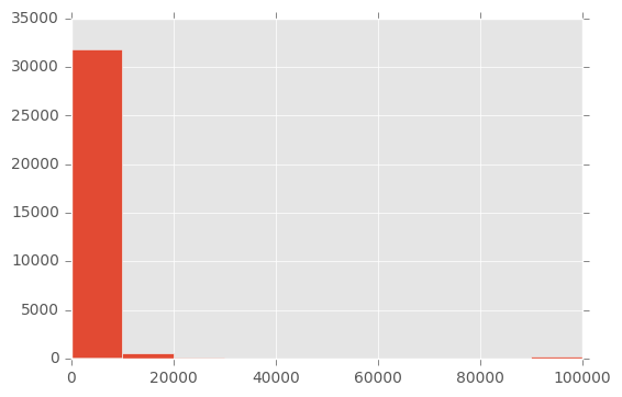
There are no particular anomalies in the age distribution. Obviously, no children were included in the data. Otherwise, the distribution corresponds to what we can expect from an industrialized nation. Let us now look at another variable: capital-gain. The description of the data only says that this is a continuous variable. Since the name itself is not necessarily self-explanatory, we can hope that the data speak for themselves:
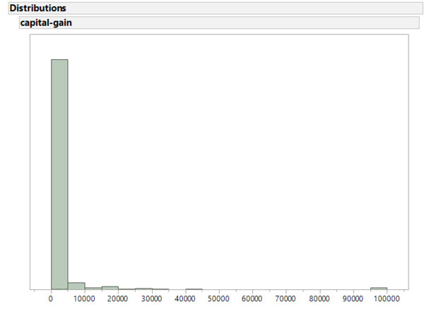
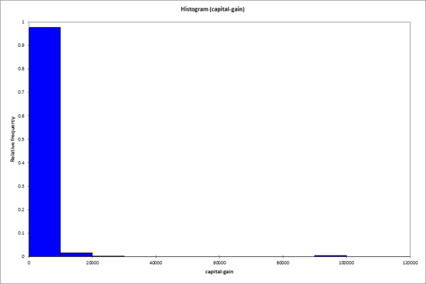
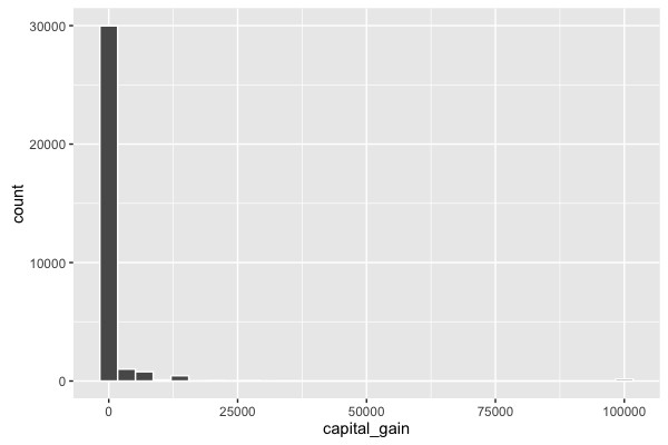
This type of histogram is seen quite often, especially when the data has already been processed. There are conspicuously many zeros in the variable. Here one must assume that at least some 0 values actually represent a missing value (NA).
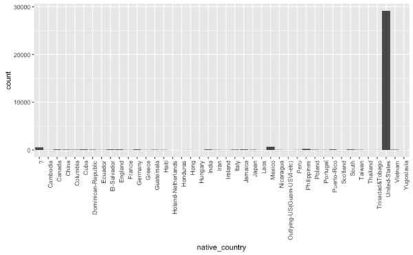
Categories overview
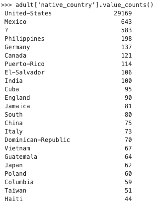
Two things stand out here as well: There is a category "?". This should probably be recoded to missing values. Almost all of the data comes from the "United-States" category. While the first problem is easy to solve in most programs, the latter presents a greater difficulty. If one gets an overview of the concrete numbers of cases, one finds that for different nationalities often only a few cases occur in the data set.
Form categories
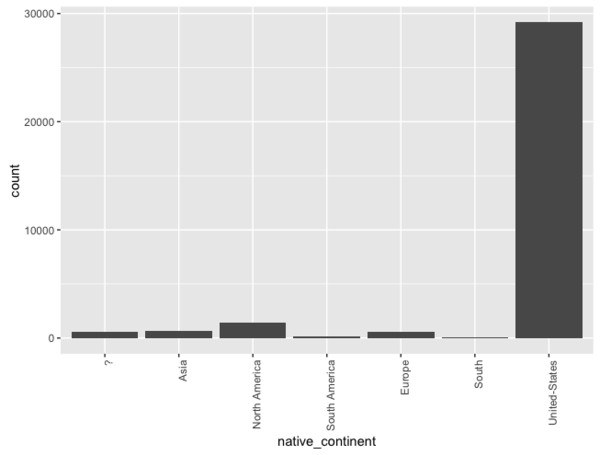
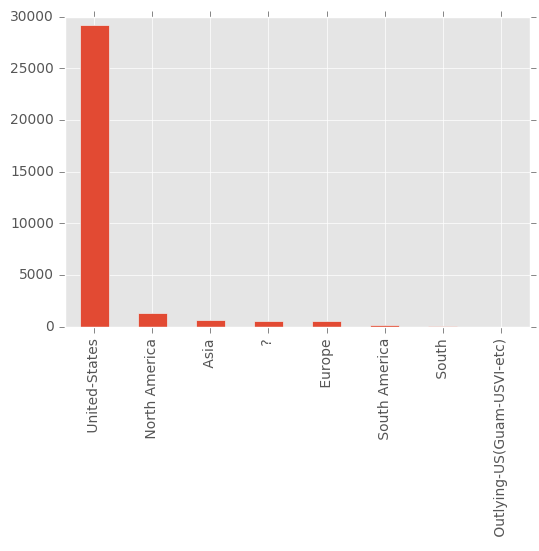
The question therefore arises whether a statement - and possibly a forecast - should/could be made on the basis of 28 people from Ecuador. A possible solution would be to combine different categories. Thus one could form a new variable native-continent, which summarizes in each case citizens with European, South American, African, Asian, ... ... descent:
Merging categories
library(plyr)
adult$native_continent = mapvalues(adult$native_country, from=c(" Mexico", " Canada", " Cuba",
" Dominican-Republic", " Puerto-Rico", " El-Salvador",
" Guatemala", " Jamaica", " Haiti", " Nicaragua",
" Outlying-US(Guam-USVI-etc)",
" Philippines", " India", " China", " Japan",
" Taiwan", " Hong", " Cambodia", " Laos", "
Vietnam", " Thailand", "
Germany", " England", " Italy", " Poland", "
Iran", " Portugal", " France", " Greece", "
Ireland", " Yugoslavia", " Hungary", " Scotland",
" Holand-Netherlands", "
Columbia", " Peru", " Ecuador", " Honduras",
" Trinadad&Tobago", " United-States"),
to=c(rep("North America", 11),
rep("Asia", 10),
rep("Europe", 13),
rep("South America", 5),
"United-States" ))
# Überblick: native_continent
ggplot(adult, aes(x=native_continent)) + geom_bar() +
theme(axis.text.x = element_text(angle = 90, hjust = 1))
Summary
This time, we took a look at some of the aspects that people often look for in Exploratory Data Analysis:
- Is there evidence of miscoded data?
Often missing values are coded with 0, ?, 'unknown' or 'other'. - Are there any unusual clusters or outliers in the data?
Recall the several instances of the variable capital_gain having exactly the value 99.999. In such situations, it is clever to investigate again how the data was collecte - How useful can a variable be for the problem being solved?
The variable native-nation shows almost only US-Americans. It is questionable whether the variable is of much use, since the other nationalities appear only very rarely. From this point of view, the data set is not very representative.
If you are interested in this topic, you should read the blog entry Data Exploration with Python by Tony Ojeda. There, this topic is discussed in more detail and systematically.
Literature
- Lichman, M. (2013). UCI Machine Learning Repository [http://archive.ics.uci.edu/ml]. Irvine, CA: University of California, School of Information and Computer Science.
- Ojeda, Tony (2016): Data Exploration with Python
[Blogpost: link, last checked: 13.01.2017]